Wednesday, November 30, 2016

Seventh Grade Apple Studies

Seventh graders have been studying the use of value, or lights and darks, in art. We started by exploring several pieces of artwork that featured the use of value for emphasis and dimensionality. Then, they practiced varying the pressure of their pencils to create different values. Through the next few months, they have honed their skills, creating values with 2B pencil, colored pencil, charcoal, and watercolor pencil. Exercises have included the "shattered values" project, which you can see here, and extensive practice drawing and shading circles to look like 3-D spheres. They also practiced using those four materials to draw apples. All of the practice exercises were done in their sketchbooks, which they've used since fifth grade.

Today, we took it to the next level for Edible Art Day, or Draw/Eat Day. They chose an apple, drew it, took a bite, drew it again, (etc, etc) until the class ended or until the apple was gone.  I have to say that I'm just blown away by these results. The color blending, the shading, the precision, and the accuracy of shape and value are just amazing. Enjoy!


Wednesday, October 26, 2016

Seventh Grade Value Studies

Seventh graders spend the first trimester learning about how to use value, or variations of light and darkness, to create special effects in their artwork. Value can be used for contrast, emphasis, or to create 3-dimensional effects, such as with shading. Each student created a contour drawing, or a drawing made only with lines. They used dividing lines to slice up the page and "shatter" their drawing into smaller pieces. Finally, they spent several classes on the task of shading each shape with a graduated value scale. If you look closely at the samples, each and every shape has a complete value scale, from darkest to lightest.


Sunday, October 16, 2016

Second Grade Portraits

Second Graders created these portrait using pencil, then Elmer's glue, on black paper. Finally, they added color with soft pastels. When the glue dries, it leaves clear, smooth lines that resist the chalk pastels- resulting in raised outlines that beautifully contrast with the vibrant colors. I love this project! It allows for such creativity and color choice, and of course they love mixing the colors with their hands. As an introduction to the project, we observed and discussed self-portraits by Andy Warhol and Vincent Van Gogh. 


Tuesday, October 4, 2016

Kindergarten Self-Portrait Collages

Kindergarteners created these lively self-portrait collages after observing and discussing the collages of Henri Matisse and the self-portraiture of Van Gogh. We discussed how collage was like "drawing with scissors." I demonstrated how to draw and cut out shapes, and how to apply just the right amount of glue. The kids loved finding all of the different colored and patterned papers in their trays, and the vibrant, adorable collages show how much fun they had.


Tuesday, September 20, 2016

Fourth Grade Artist Eyes

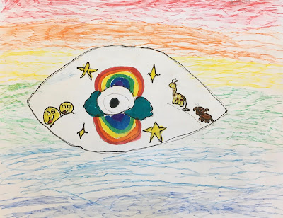
Fourth graders created these "Artists' Eyes" on their first day of the year in art. As prompts, I asked them (and wrote on the board): How do you think artists see the world differently? How do you see the world? What do you see that makes you want to create artwork?  The results are always so individual and so unique. 

The football eye with the baseball pupil! Awesome. This student also used creative problem solving and saved himself from an "oops" moment in the background by cutting off his mistake, and cutting out the parts of his paper he liked and mounting it on a new paper.

The asymmetry and the detail on this Artist Eye are so attention-grabbing! You can tell this is a cat lover; she draws cats often in the art room.

The textured, shaded background on this one makes the carefully outlined details stand out. The double rainbow is like a reflection, and the symmetry creates a shape like the iris of the eye.

 Singing and fashion are two of this artist's major interests, as you can see! The realism of the eye is a beautiful mix with the stylizing of the background and the details.

The patience this student used to create these planes of color was wonderful to see! They definitely took a different and fascinating approach, choosing to create an almost abstract work of art.

This student has blossomed so much! When she was younger, I often used to have to encourage her to add more detail- now, as you can see, she's got detail for days! There's so much energy and so much to look at in this beautiful work.

I love how the rainbow in this one is like the eyelid, and how the artist cleverly incorporated the pupil and the sun, almost like an eclipse. The texture of the waves stands out against the smooth background, and your attention goes right to the portraits because of the way the artist arranged them on either side, in balance. This is pretty sophisticated and intuitive composition, right here!

The smooth background, and the use of complementary colors, was a great move here! It creates a sense of balance, and it makes every color of the eye stand out. The sun-pupil is creative too!

The eyelashes are transformed into grass, which is lovely addition to the nature theme in this eye! The pupil is an adorable puppy. 

I was so impressed with the effort this student made to create detail, and smooth, thorough coloring. The color choices are vibrant and daring!

Wow! There's so much to see here- from the dramatic zig-zags to the blended colors and the movement of all the different patterns in combination. The artist was careful to explain to me that the scribbles were actually on purpose, to show that that's ok sometimes.