Thursday, November 19, 2015

Zentangling with Eighth Grade

Zentangles are patterned, geometric doodles designed for meditation and self-expression. This is the first unit of the eighth grade art curriculum. I had planned for it to go for about 4-5 classes, but here we are in November, and they are still completely engaged and going strong. Many students report doodling Zentangles during classes, and many students have been coming in at Open Studios (extra art time at recess Fridays) to Zentangle.

I am always amazed at the complexity and intricacy of these projects.  This unit truly brings out the best in my eighth grade students. There were moments where it was so quiet you could have heard a pin drop- not exactly a frequent occurrence in a middle school classroom!

I began the unit by presenting them with about twenty official Zentangle patterns printed from the website. They taught themselves the patterns step by step, then invented several of their own Zentangle patterns. Then, they chose from many different 2-D and 3-D media to create their Zentangles.

Here are some of the patterns:

Official Pattern: Curvaceous

Official Pattern: Cirquital

Official Pattern: Ciceron

And here is some of the student work:

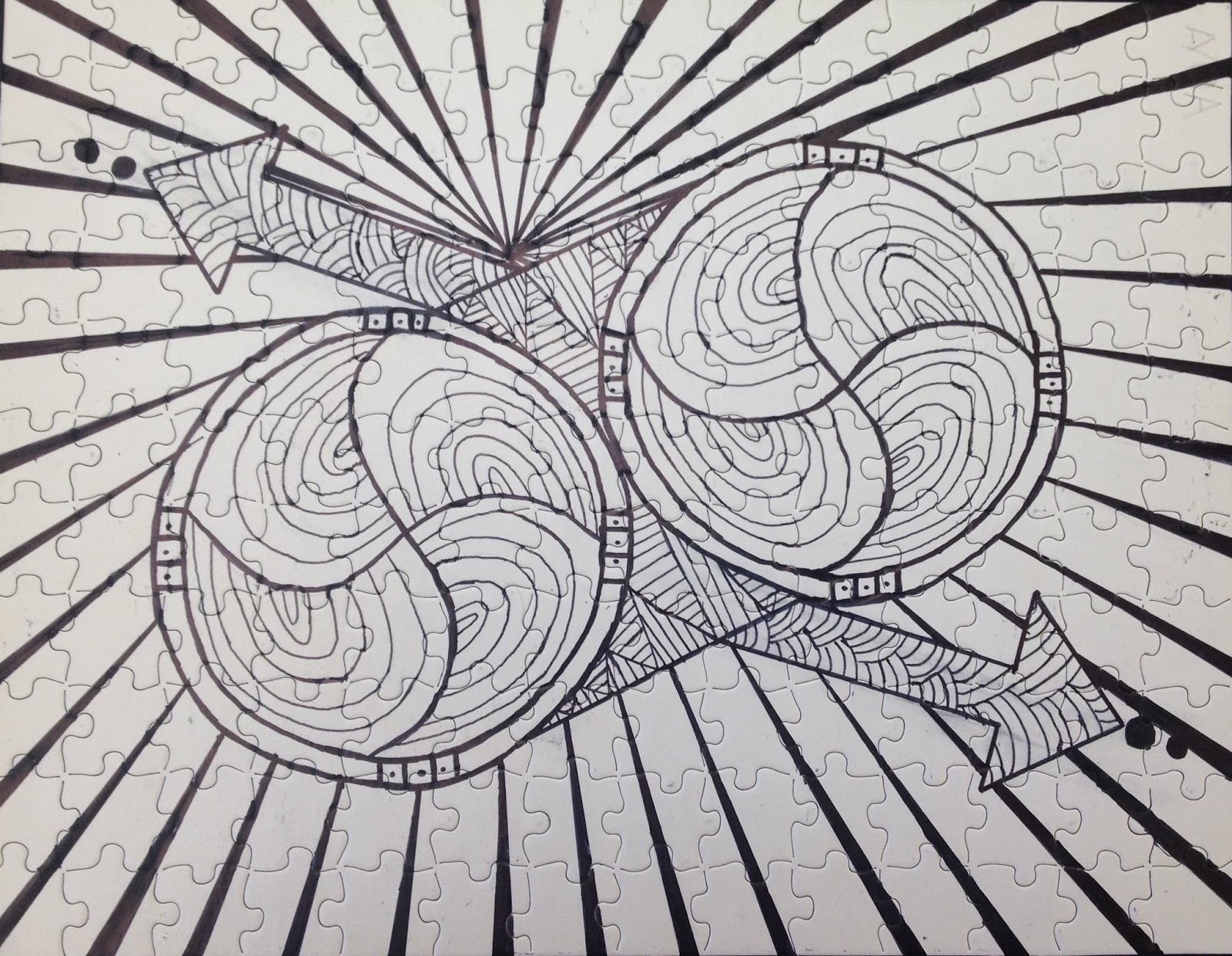
This Zentangle was done on a puzzle template with Sharpie.

This Zentangle was done painstakingly in HB pencil.

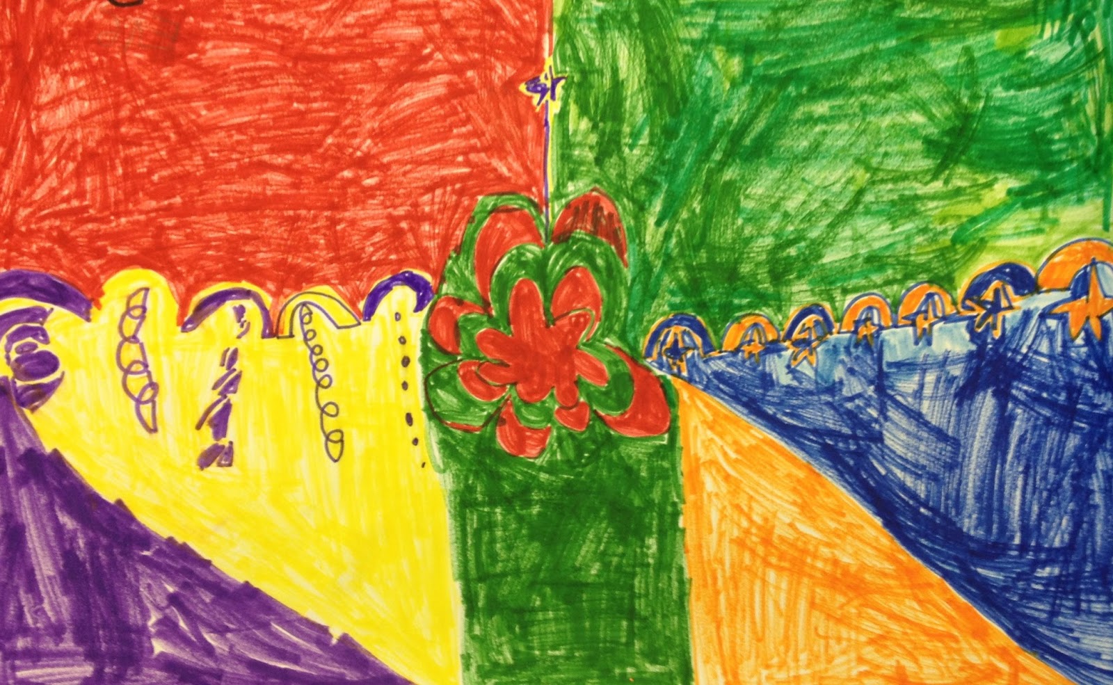
It is always nice to see an infusion of color in the Zentangle projects!

The students also had the option of working to create their designs on the myoats.com website. This entrancing program allows users to create their designs with radial symmetry. You can adjust the quality of line and adjust colors and shapes, then download your designs. It is a very cool process! 


This was also done in pencil. The student adapted several of the official patterns. He sits next to the student who did the pencil Zentangle above. They were a laser-focused team!

This one is Sharpie on cellophane. It will look incredible on a window- like stained glass!

Another incredible puzzle Zentangle. The one in the middle is an original Zentangle by a student. He named for Rosa Parks because it looks like a rose.

Another puzzle Zentangle- this was a popular option this time around! I love the bold Sharpie outlines and the unexpected color choices. This student frequently insists that he "is just not a good artist." I am on a campaign to convince him otherwise- just look at this!

This student worked on watercolor paper with Sharpie. She blocked off the white areas with masking tape. After the Zentangles were complete, she carefully applied watercolor washes to the surface, then removed the tape to create the striking white lines.

Interested in trying Zentangling out on your own? There are many great books, and many patterns are published on Pinterest as well. Or, you can always stop by the art room!

Friday, November 13, 2015

Prints in the spirit of Kanga cloth

Fourth Graders looked at Kanga cloths from Tanzania. Kanga cloths are decorative and wearable fabrics that contain a blessing, advice, or a wise saying.


Wastara Nimestrika Mlilolitaka Halikunfika
"Destined to be safe, I remain protected, and your evil wishes 
have not materialized."

Other examples of Kanga texts:

  •        Majivuno hayafai — Greed is never useful
  •        Mkipendana mambo huwa sawa — Everything is all right if you love each other
  •        Japo sipati tamaa sikati — Even though I have nothing, I have not given up my desire to get what I want
  •        Wazazi ni dhahabu kuwatunza ni thawabu — Parents are gold; to take care of them is a blessing
  •        Sisi sote abiria dereva ni Mungu — We are all passengers, God is the driver
  •        Fimbo La Mnyonge Halina Nguvu — Might is right
  •        Mwanamke mazingira tuanataka, usawa, amani, maendelo — We (women) want equality, peace, and progress
  •        Naogopa simba na meno yake siogopi mtu kwa maneno yake — I’m afraid of a lion with its strong teeth but not a man with his words


After exploring these beautiful fabrics, the fourth graders sketched their own geometric designs. Then, they carved them into styrofoam sheets, which they used as printing plates. They rolled printing ink onto the printing plate, being careful not to put on too little or too much ink. With practice and experience, they learned to use the correct amount by both looking at the styrofoam and listening to the sound as the roller went back and forth over the ink- ideally, it should make a sticky noise. 

Printmaking is a somewhat variable and unpredictable process, which leads to a variety of different and beautiful results. This project is a great lesson in learning how to problem-solve and to trouble-shoot.


 "Life has its downs that you have to turn upside down."

"Be Yourself" 
 "Try and never give up"
 "Draw from the heart"
 "You shall be protected"
 "Life is a roller coaster- Ride it!"
 "Things can be different than they really are!"
 "Be creative"
 "The world is a mystery"
"Love will never end"


Thursday, November 5, 2015

First Grade Color Theory

First graders have been learning about the properties of colors and how they are used in art, including primary colors, secondary colors, and complementary colors. First, we looked at the color wheel and I explained that the primary colors (red, blue, yellow) were like the building blocks and that while they could mix to make other colors, you can't make them by mixing colors. 


Then, I showed them examples of how two artists had used only primary colors in their work. We looked at Stepping Out by Roy Lichtenstein and Broadway Boogie Woogie by Piet Mondrian.


Then, I presented the project, where first graders had to choose primary color collage materials from a bin of collage papers. I also offered "gifts" of secondary color (green, orange, and purple) materials but they said "No thank you!"


Next class, they mixed primary color paint to create secondary colors. They painted shapes with the new colors. Then, they cut out the shapes and drew lines and labels to create their own color wheel.


Next, I introduced complementary colors, pairs of colors that make each other look brighter when juxtaposed. These include purple & yellow, red & green, and blue & orange.  We observed abstract paintings by Sonia Delaunay, then they tried their hand at creating abstract designs with complementary colors.


Tuesday, November 3, 2015

Seventh Grade

Hello seventh graders! This is a great video I found on Pinterest. It shows a teenager shading a circle to create a sphere. I hope it is helpful to you in your learning process.

Best,
Erica